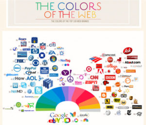
 ColourLovers has released a really cool new study. They placed the logos of the Top 100 web brands on a color wheel. It was amazing to see how the use of color shook out: most companies used a lot of color, with only 6 companies using a primarily black, white, or gray color scheme.
On the other hand, blue was definitely the most popular color. Looking back on my own logo designs, blue also shows up a lot. Why is this?
According to color theory, each color on the wheel makes us feel a certain way. In Western cultures, blue is associated with peace, tranquility, law and order, loyalty, and productivity.
The second most popular color was red, which was used primarily by media companies (CNN, ESPN, BBC, etc.). This actually makes perfect sense, as red actually stimulates your body and causes increased heartbeat and breathing, making you more alert and attentive to your surroundings–perfect for companies that specialize in getting the scoop first.

The rest of the colors were spread out fairly evenly across the color spectrum, and you can find out what they all mean with this great post on the Marketing Tech Blog.
So what does your logo color say about you? If you haven’t looked into color theory, you might be surprised.
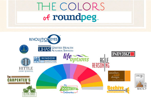
Check out some of our logo samples. While we use a lot of blue, we have had fun with some very unusual color combinations as well.
