Like many not-for-profit organizations, Congregation Shaarey Tefilla’s marketing materials were a collection of mismatched documents held together by the common thread of their logo. They came to us looking for a more cohesive look to their brand.
Fortunately, they had a strong logo we could use as the foundation for all the designs. They were very fond of the strong black bar with multiple stripes which was the header on their website. They wanted this bar applied to all the elements of their branding package.
This is a mistake I have often seen amateurs and new graphic designers make, rigidly applying brand standards without consideration of the use and functionality of an individual piece.
While it would have been easy to simply paste the branding bar everywhere, it would have been overpowering on many of the pieces. Jenna’s challenge was to find ways to modify the elements so each piece stood on its own, yet still looked like part of the same brand.

She started with a thinner version of the banner, with fewer stripes as the foundation for all the print elements. This is the banner on the the letterhead.
For the envelopes, the bar is even narrower, and the strips are removed. On the business cards, the stripes and the black bar are separated, with the stripes floating on white on the front of the card.
Finally, the note cards were designed with the least amount of branding elements to give the user room to write.
The next piece of the project was to extend the brand to other pieces of marketing material. As you move beyond simple stationary into sales literature and forms, it is often challenging to maintain the same branding feel.
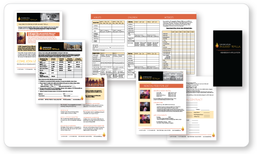
The elements of the membership package contained charts and tables. In some cases, the requirement was that all the information had to be displayed on one piece to minimize printing cost. We added contrasting orange for emphasis on some of the pieces, and it is carried to the inside page of the application.
While every piece has its own features, each will work well with the letterhead, notecards and envelopes. We are still putting the finishing touches on some of the designs, but now our client has a consistent more polished look to impress prospective members.
This is just one example of project work by the team at Roundpeg, an Indianapolis Graphic Design firm.

