Earlier this year, we created a website for Randall Beans which reflected the classic, wholesome style their company is known for. We created a look that was on-brand using similar textures and graphics from the labels used for the jars of beans.
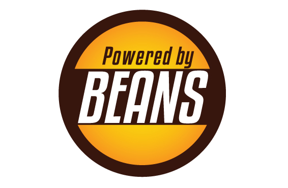
This time around we helped them come up with a complementary logo and blog for Powered By Beans, which is focused on health and fitness.
The difficult part of this process was finding a good balance between modern and classic styles. The target audience for Powered by Beans is a younger and more health conscious crowd than the original site, so we wanted to keep everything fresh and simple while still making it easily recognizable as Randall.
The jar lids are one of the most unique features of the Randall Beans brand, so I used them as inspiration for the new logo. The circular shape helps convey motion and allows the design to be easily placed on existing Randall Beans materials. Besides being a nod to the original jar lids, I wanted this logo to feel similar to a badge or stamp of approval, in order to convey the idea of a positive healthy lifestyle.
I stuck with Randall’s classic brown and a more vibrant version of their orange. After adding a slight gradient to the orange, I was able to achieve a glowing effect, which really energizes the logo and makes it stand out.
The font was chosen after I spent a lot of time studying sports drink branding such as Powerade and Gatorade. I liked the way these brands used their fonts to imply power and motion, and tried to bring that same feeling to Powered by Beans. The final logo ended up being modern and young, but still had ties to the original Randall Beans style.
It’s always tough to take a classic brand and bring it into the 21st century without sacrificing the fundamental look and feel, but we think that’s what we’ve managed to do. For more information on healthy lifestyles and great bean recipes, check out PoweredByBeans.com.

