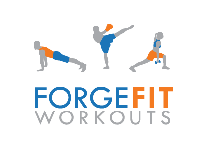
Does this logo look familiar? Just over a year ago, we created this branding look for KnowSweat Workouts. Recently, our client parted ways with her partners at the local gym. They kept the name, but she kept the artwork for the logo.
We think she got the better end of that arrangement, because we were able to use the artwork for her new company, ForgeFit Workouts. While we kept the same font treatment and graphic design, we did use this opportunity to update the color scheme. The new orange and blue has a little more spark then the original version. It was a quick change, and our client is up and running with her new branding in a few days.
From time to time, companies do change names. Maybe there was a merger or split, new partners or simply a slight change in direction. Whatever the cause, a new name requires a branding discussion to decide if can you simply modify your existing materials or if you need a completely different logo.
Here a few simple questions you can ask to help make the decision:
- Is there any negative association with the original brand? If so, a new logo gives you a chance to wipe the slate clean.
- In contrast, do you have strong equity in your existing name or in the name of the company you are purchasing? If so, you want to hang on to what you have. When Southwestern Bell purchased AT&T, they chose to change the company brand to a modified version of the AT&T logo. Why? Despite the ups and downs over the years, AT&T still has the strongest name recognition.
- Is your business model essentially the same? Then a minor modification may be all you need. This is fairly common among firms which include the names of top partners.
- Is the new name about the same length and with the same rhythm as the old one? In this example, KnowSweat and ForgeFit were similar names. Both were comprised of two words pushed together, with two capital letters. The new name slide easily into the space of the old name.
- Was your old logo any good? If you had a solid design, it makes sense to try to keep some of the best elements. In the case of ForgeFit, the images of the exercising people were definitely elements our client wanted to keep.
For ForgeFit, the slight modification was absolutely the right choice.
