When clients visit Roundpeg for their first web design meeting, we spend about 15 minutes looking at websites. We ask clients to bring a list of their competitors’ sites to get a sense of their market and another list of websites they think simply look good, from any industry. Looking at other websites for inspiration is a key part of working with your web designer to convey your desires. Most of us don’t have all the right words to write out what we like, but we know it when we see it. Browsing the Internet with your web designer creates opportunities to ask what draws you to a site, what’s the best part and what’s an idea we can build on. I thought it would be interesting to find ten websites I thought had something special. Some of these I knew about already, others were found on web design blog Line25 and branding blog Brand New. Some of them are on the cutting edge, some are a tad behind (on purpose). All of them have at least one thing to give you pause and take note for your next web design project.
Vardagen
Straight up, I picked this one because the t-shirts are cool. But I also want to point out the complete lack of extra lines, borders, backgrounds, or other “chrome” on the edges of this site. Backgrounds are edge-to-edge when possible. There’s actually very little white space. It’s all about their great product photography. A perfect example of content-first web design. vardagen.com 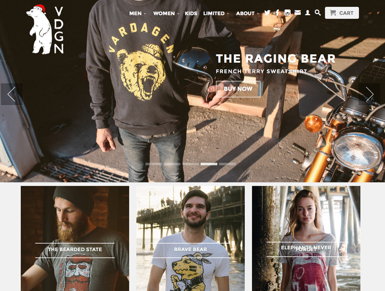
Shinola
Here’s a second retail site with a minimalist touch. But I really want to talk about Shinola’s story. Roll over Our Story in the navigation and you get a neat image-based menu with three options: Blog, Places We Work and Why Detroit. Blog is the blog, obviously, but Places We Work is actually a thoughtful breakdown of each partner company contributing to their products, including spotlights for staff at each of those companies. Full width images accompany each section of each page, really selling me on the craftsmanship and care taken on their products. shinola.com 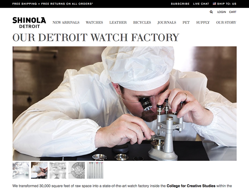
Moov
After looking at two über-hipster web destinations, Moov livens things up with athletic colors and futuristic branding. Check out the cool video background too. With new products like Moov, you really need to educate consumers about how to use your product. The background subtly illustrates all the ways people use Moov and invites you to scroll down for even more. moov.cc 
Quality Fabricated Solutions
I really enjoy the full-color video background here. Slow motion was invented in 1904 and it’s been blowing people away ever since. Full disclosure: I also really enjoy this site because Roundpeg designed and built it. We carefully selected a video background that would complement the homepage message and not distract from it. Slow motion helps, dark colors (to contrast with white text) are required and sparks because sparks are cool. qfssolutions.com 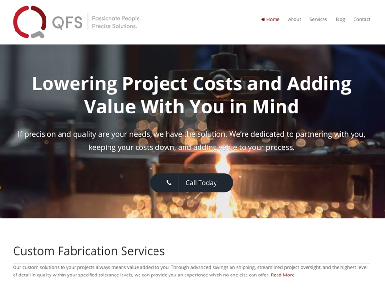
OKFN
Ok, ok, this doesn’t blow me away. But it’s perfect for a research-focused, academic and political audience. The site’s really clean and looks like it’s on a framework that lets OKFN add a ton of text-only pages that look great without needing images. okfn.org 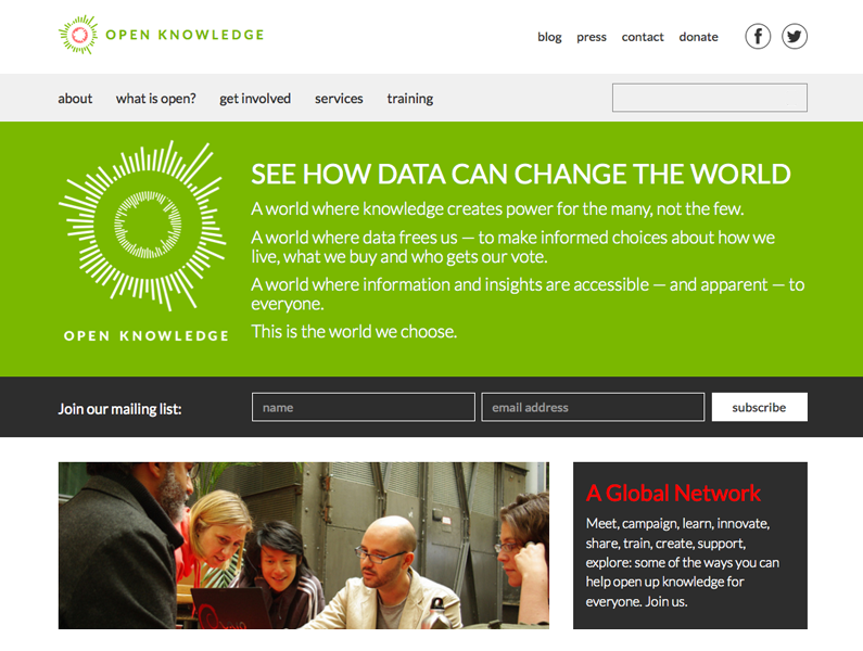
Evolve Wealth
Accountants, bankers and other folks in financial services aren’t known for exciting web designs. Words and numbers focused businesses have difficulty with the image heavy layouts favored by designers. Evolve Wealth stands out with clever illustrations and copywriting in a minimal layout that looks really fresh. evolvewealth.co.uk 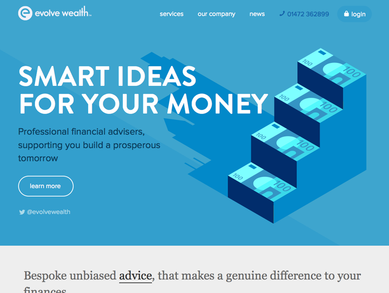
Southwest
Here, I want to point out the coolest call-to-action I’ve ever seen. As of 11/29, the top of the page promotes flights to winter destinations. The body copy starts with “Save on winter flights.” It actually finishes inside the call to action button with “Book by 12/1”. The strong verb paired with a date nail the urgency required to make fingers itch to click. southwest.com 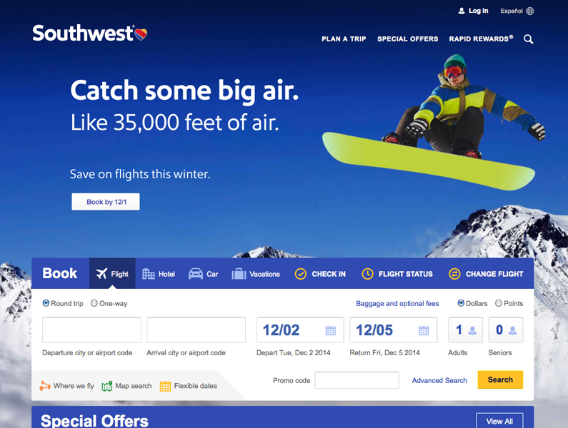
Flywheel Pricing Page
Website hosting is a complicated business. But Flywheel explains their products and services with clarity and depth. Check out the way their plan comparison chart compares apples to apples. Seems obvious, but accurate, skimmable comparisons are the biggest challenge to pricing tables people will actually use. There’s much more to love on this page, including a cleverly designed testimonial, feature descriptions and FAQs. getflywheel.com/pricing 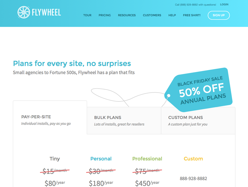
Vital Herbalist
Bear On Unicycle
I love the simplicity of this site. There’s a compelling mission statement, examples of work and minimally presented contact information. The two other pages are a picture of a bear on a unicycle and warm thank you. This is a perfect, complete website in less than 100 words. bearonunicycle.com 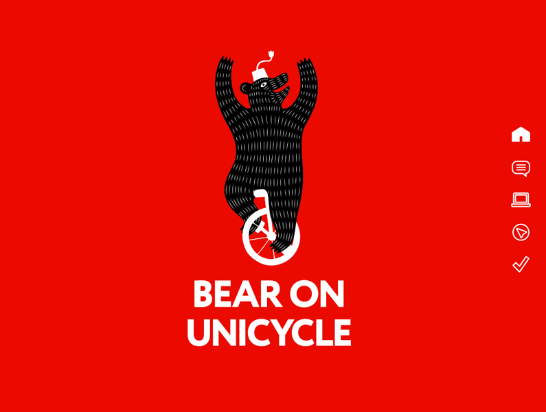
If you liked this post, make sure to check out my Revenge of the Podcasts blog where I showcase some of my favorite podcast websites!
