We’ve seen many websites shifting from a “wall of text” homepage to a simplified landing page with a short business description, beautiful imagery and one action for a visitor to take. (See Peter’s favorite examples of hip, trimmed down designs here). What does this mean for your business? If you still have a cluttered home page, you need to figure out how to parse the mountains of information you have on your homepage. Divide it into short digestible chunks of information and move some of the heavy details to internal product or service specific pages and add smart navigation to guide the visitor to the right place.
Dividing and Conquering
Users come to your website in much the same way customers enter your storefront looking for different services. Some want to explore and others what to go directly to what they came to find. Some might only show up if you lead them directly to a niche offering, opting to ignore your other products entirely. Chances are, few of them are interested in knowing every single detail of every one of your service offerings all at once. It’s simply too much information to dig through.
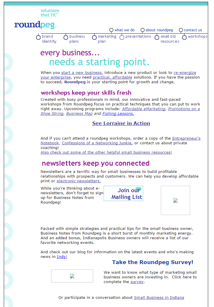
In this conversion rate example by ConversionXL.com, the author shows a measured growth on four of the websites he manages by simply reducing the amount of content on a page and narrowing down customer options. How can you do this on your site? For an example of a drastic before and after let’s take a look at what the Roundpeg website looked like in 2007:

Before we do any analyzing, bear in mind this was cutting edge in 2007. This was a perfectly acceptable way to present all of your information at a glance. And while long pages are returning, they are coming back with more focus and a cleaner path then we had on our site 7 years ago.
The navigation presents way too many choices at the top of the page. While there is a difference between marketing and business plans, consolidating them under one heading would make things much cleaner. The same is true for workshops and presentations. Are you cluttering your navigation with too many choices?
Continuing this theme of too many options, our old design was littered with multiple links throughout the page. Where should visitors go? Back then the idea was to link, link and link again. This has been replaced by a simple single call to action at the top.
Next look at the content on the page. Here are the three sections I see we can work with right off the bat:
Workshops: Seminars and workshops are still a big part of what we do at Roundpeg. The information in this section lists out the different offerings, but makes our page pretty top heavy. To clean this up, we can move this content into our “Resources” section, letting us include more detailed information for the 4 sessions listed.
Newsletters: We want make an impression on people with the quality of newsletters we produce for clients. Confining this information to one or two paragraphs on our homepage stifles that opportunity. By moving this content into an internal page and showcasing some of our most successful newsletters, we give the visitors who care about this service much more information with which to make a purchasing decision.
In the latest incarnation of our homepage, we’ve added a small call to action for users to sign up for this service immediately. The technology for homepage design has evolved so we can replace the “join our mailing list button” to let us display this offer in a really cool, minimalist style:

Annual Marketing Survey: We still collect data for a digital media survey every year to track online marketing trends among business owners. While it’s a great piece of content for us to share with out network, it really isn’t one of the top three things we offer so it doesn’t have legs to stand on its own on the homepage. Instead, we can nix the info from our homepage and move it to a topic specific survey results landing page. By the way, we are once again collecting data and you can take the 2015 survey here.
Moving Into the Modern Age
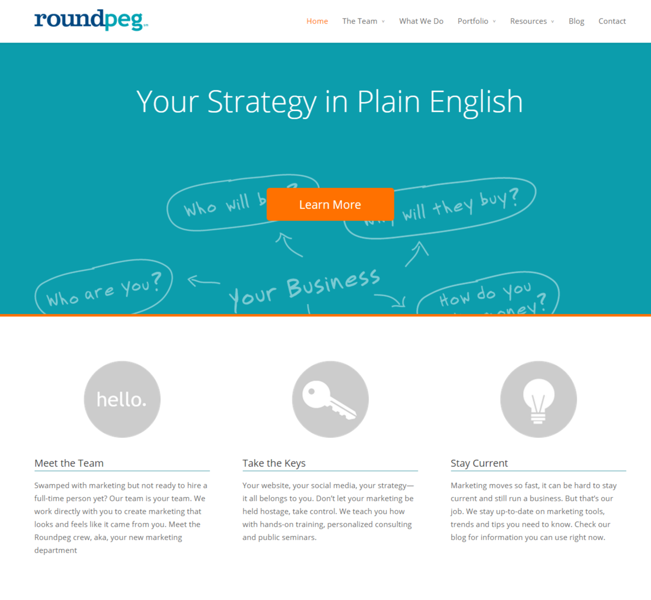
Just to prove we subscribe to our own medicine, here’s what our homepage looks like almost 8 years later:

The wall of text is now gone and has been replaced by an eye-catching visual. We also give the user only one option: to “Learn More” about our company. If the user scrolls down, they are met with a few additional options and service explanations, but the majority of the homepage is dedicated to a modern, clean-cut approach.
Even if you take these examples to heart and improve your homepage, people might still hate the way your website is set up. Before you do anything drastic, make sure to download our web design refresh guide to plan your strategy:

