The current style for web design is to lead the page with a giant image. Strong visuals combined with just a little text pull the visitor in.
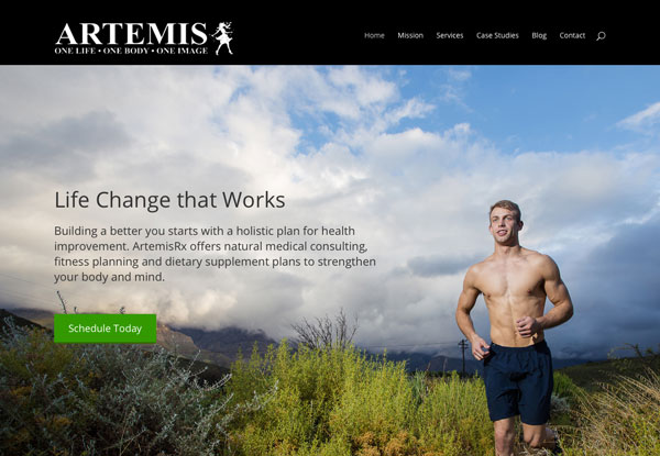
When you look at a site like the one we designed for Artemis RX the image fills the entire screen with very little text to add to the story. The bottom line, if you want to feel like this guy, push the button and get started.

This design trend is great if you have the one terrific image, but what if you don’t? If your brand doesn’t tell its story with pictures how do you fill the space?
Subtle and Professional
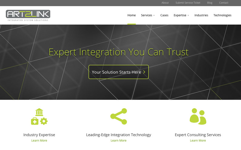
This was the challenge we faced as we created the design for Art2Link. As a company which provides software integration solutions, their product is usually invisible when it is working correctly.
If you look at many of their competitors you see one of two options for the cover image. The first features stock photography (often the same images) of people working in groups, on computers, looking smart and interested.
The second common approach is to use a complex flow chart which shows how all the pieces of the system fit together. While meaningful for the company promoting their service, it has little or no meaning to a prospective customer.
Our solution was to fill the space with a simple visual which communicates at a glance the idea of a web and the connection between things. There isn’t however a lot for the viewer to figure out so they can glance at it and move on to the informational content portion of the website.
Light and dark versions of the theme are used as accents and background images throughout the site and on complimentary printed material.
The sleek simplicity of the design supports Art2Link’s brand as resource who will simplify your business communication issues.

Simple and Meaningful
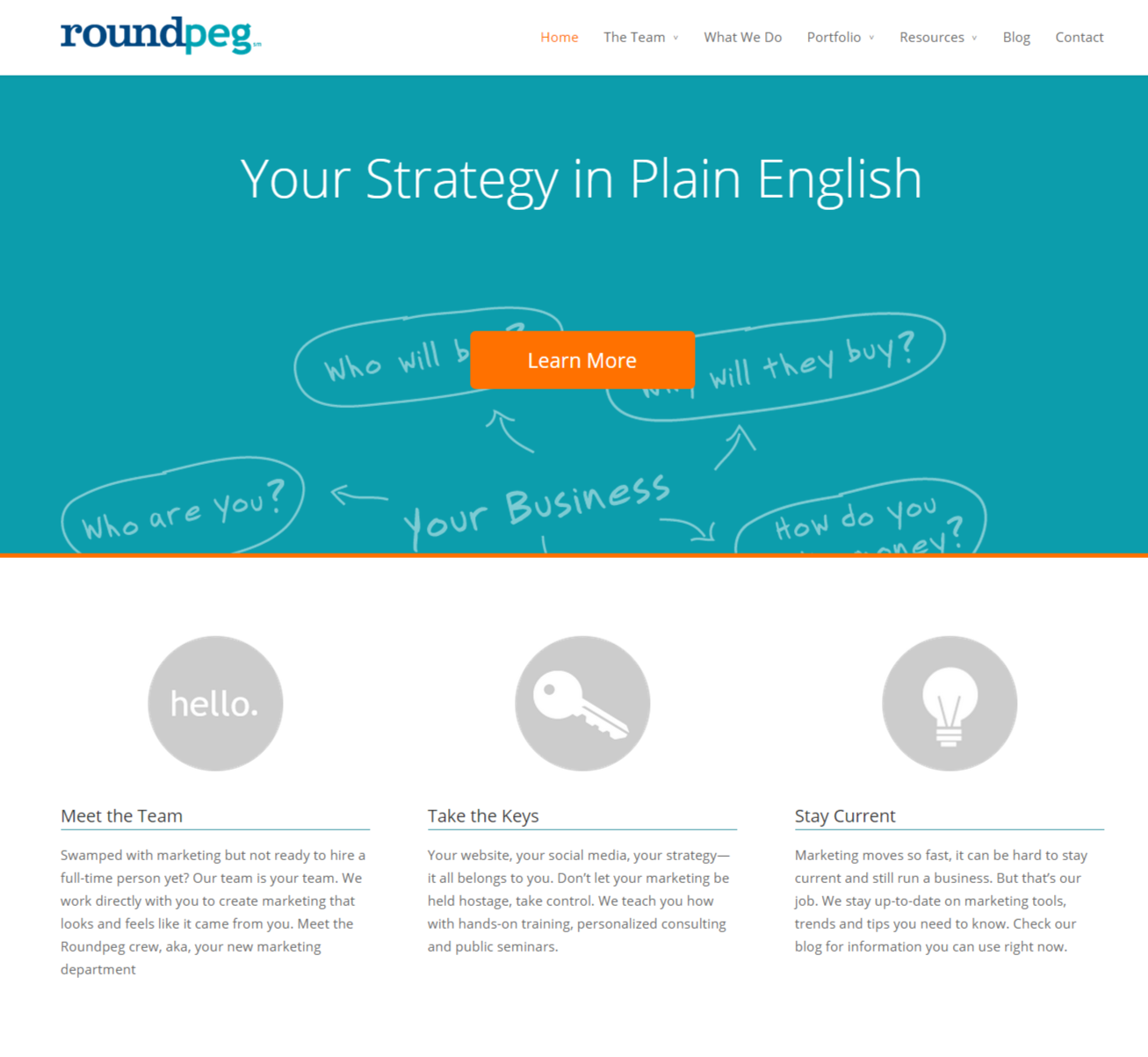
Roundpeg is also not a “photography brand.” With our brand, we took a slightly different approach with our hero image.
While the image is primarily wallpaper, we made very deliberate choices in the design process. We wanted to communicate our casual approach to marketing, so we opted for a hand drawn image instead of a structure flow chart. And the choice of questions rather than statements helps convey our willingness to listen to clients.

The large hero images are here to stay, until some other design fad takes over. So, take some time to look at lots of options as you update your website. Then pick one which helps tell your story at a glance.
Before you choose to take these options to heart, we highly recommend reviewing the current state of your website. Access our website self-audit tool today to see how your site stands up to current best practices:

