2o14 was a good year for web design. Flat design broke into the mainstream, challenging designers to adapt radical design ideas for real-world customers. Renewed interest in storytelling sparked experiments in fluid, single-page web design. Animated homepage sliders march a slow path to the grave, but they’re marching. And yes, I still hate them. But I think web design lost something on the way.
Your homepage lacks an update strategy.
Back in the day, most websites were built like storefronts: big windows (slideshows) sandwiched between a logo and the stuff on the bottom everyone ignored. Small businesses filled these windows with special offers and vanity projects. Change the slides every once in a while, leave everything else. Slideshows were the update strategy.
Now that sliders are out of the picture, what’s the new plan for offers, announcements and other temporary content? You might not think about this during the buzz of web development unless a savvy web designer asks you.
We recommend designs that encourage customers to make a single decision, supported by complementary content. The ideal web design is a race car, not a bulletin board. Each call to action is carefully placed and tied into a larger marketing plan. However, with such a programmed approach, you need a strategy for un-programmed information.
Strategy 1: update on top of everything

I kind of hate this strategy. Adding a pop-up or notice on top of the existing content diminishes everything. Using poorly designed pop-ups is like pasting an ad for your company over your own front door. It certainly gets your info out there, but not necessarily in a good way.
Well-designed website notifications improve on pop-ups by matching your site’s branding and presenting truly useful information. News websites use notifications to grow their email lists and boost traffic to featured articles. Retail websites may announce a flash sale or discount with pop ups and notices inserted above the header.
Notice how the communication I described was planned in advance. Pop-ups are not your silver bullet. They’re quick to produce and implement, but are best deployed to serve the big picture. Don’t use them for any vital information or action.
Strategy 2: update everything at once

New information that doesn’t fit the big picture is a distraction, leading to diminished performance. Gross.
Ideally, you would know what to do with that information before it was time to present it. We’ll talk about accomplishing that in a minute. But, if you’re stuck with an important announcement and no idea where to post it, it’s time to update the whole homepage.
Yes, the whole homepage. Many old web designs are built on stiff frameworks which don’t allow for variations. New web designs are tied to bigger marketing plans. In either case, incorporating the new information means drawing a new outline. You should never tack something up and assume it won’t affect the surrounding content. Maintain the integrity of your marketing by considering how the new information fits into the overall plan, revise the plan, then revise your web design.
This makes extra work, but it’s the right thing to do if you haven’t planned for this kind of change on the front-end.
There’s nothing wrong with redesigning your homepage. The latest design frameworks allow for completely redesigning this space without changing the interior content. Some companies do it every quarter, or every time their marketing plan calls for a new promotion. Affordable tools like WordPress bring this functionality to small businesses.
But homepage changes like this may not be right for all small business web designs. Many business owners look for minimal maintenance and maximum value in their online tools.
Strategy 3: dedicate space for change
Pop-ups are highly specialized and rough on your customers. Updating the whole kit and kaboodle is an expensive disruption. But there is a compromise: design your website with dedicated spaces for frequent updates. Build change into your story. Put change where users expect it. Label it clearly.
If you run special offers, include that information during the discovery and research phase of the web design. Plan this space from the start so you don’t have to squeeze the ads in later.
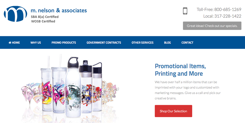
Check out the way M.Nelson & Associates communicates their specials. Roundpeg designed this website last year. The header prominently displays phone numbers, the main way customers order, with a clear call to action that opens their quarterly specials. Place announcements and updates with the tools customers use to act on your new information.
M. Nelson’s phone numbers don’t change. But the specials change quarterly. And the button text and appearance is designed to be easily updated. We identified the importance of specials early in the web design process and designed this area so the client could update it on their own with training.
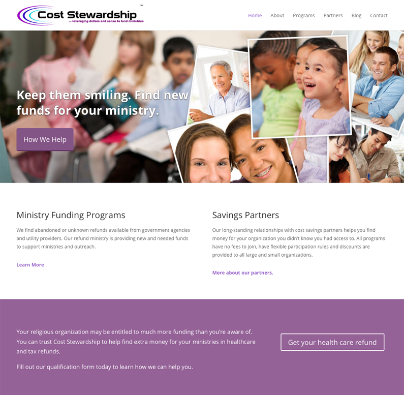
Cost Stewardship is a financial consulting team for churches and nonprofits. They don’t run specials. But they promote different programs throughout the year. Roundpeg designed their site with a special homepage section for this purpose. It’s located below the main page image and a description of their benefit to customers.
This might seem like a long way down, but it’s just one flick of the index finger and barely one scroll wheel rotation. And people do scroll. A lot.
Your most important information should always be near the top, but content below the fold is just as visible. Notice how the promotion section is completely text. It’s attractive, but easy to update and maintain.
When you plan for change, both how it looks and how it happens, you eliminate future web design crises. Do you have an updated strategy? Your customers wish you did.


