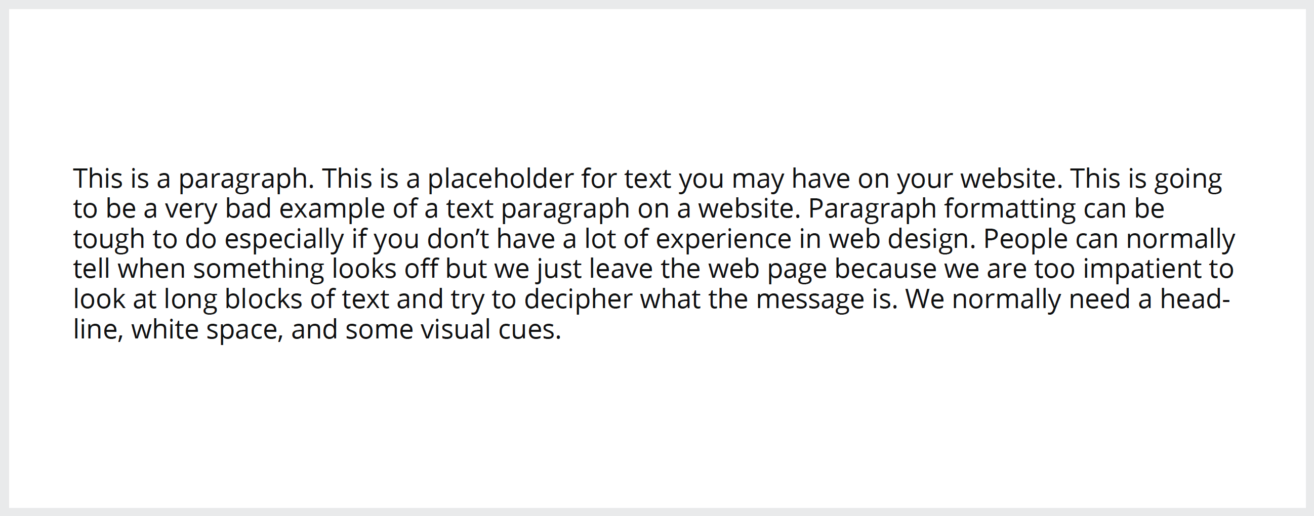
Picture this: You arrive on a website and are greeted with this block of text:

Would you stick around and read this kind of web content? Would you expect your user to stick around? I know I wouldn’t. As a designer, I know it’s important to get a user’s attention and to keep them interested throughout the experience on the site. This includes formatting the longer blocks of text which may be killing a website.
A website is not a book
When someone picks up a book, they expect to read information in paragraph format. When someone visits a website, there is only a brief period of time before interest is lost. When in doubt, think about your information in small chunks your reader can digest easily.
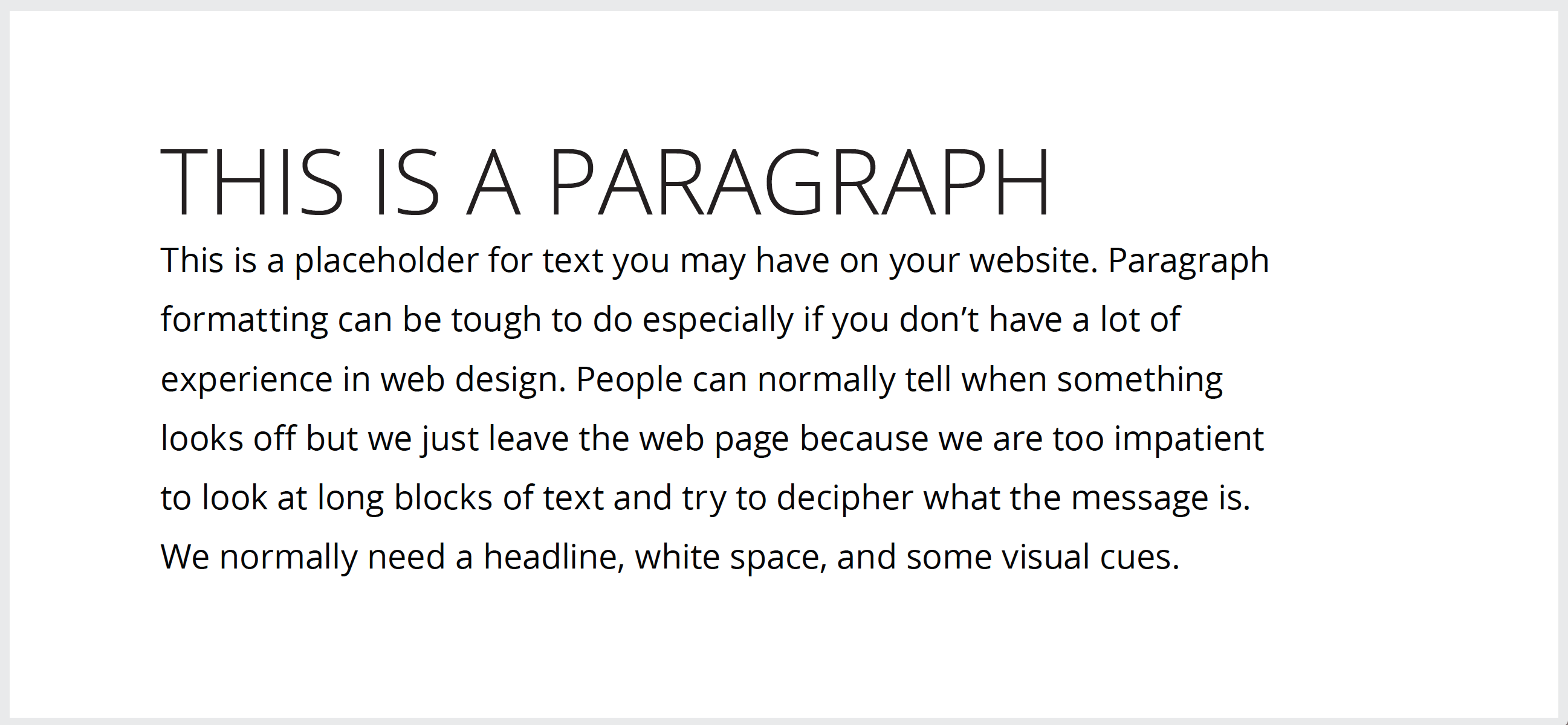
When I’m formatting text, I start the process by giving a larger paragraph an appropriate heading to draw the viewer in. The heading should be approximately 200-300% the size of the text in the paragraph. In some cases I may include a subheading underneath the main heading.
Keep the line width at a manageable length for the reader. If a block of text is too wide, it feels awkward to read. A good rule of thumb is to limit your characters per line to between 50 & 70 and give it the right amount of breathing room (whitespace) on both sides. Also, a line height of 1.5 will improve legibility for the user. The takeaway: if the lines of text are too close together you’ll lose legibility. White space is equally important both on the sides of the block and in between lines.

Is it visually appealing?
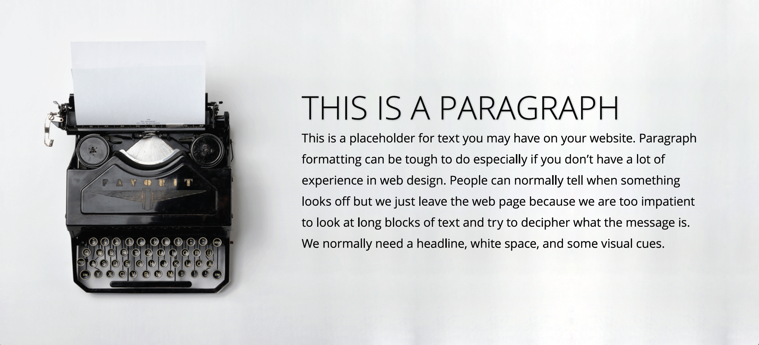
Most people will agree a great website provides pertinent information and is also easy on the eyes. When I’m formatting content on a site, I add in visual elements which compliment the formatted text (whether it’s a picture, icon or texture). In this case I chose a full-width image which places emphasis on an object on the left side of the screen and adds balance to our section composition. Then I normally will adjust my heading to make it more polished.

Get someone to edit your work!
I stare at websites all day so it’s easy to fall into the legibility trap when you’ve read over copy again and again. One tactic I always employ is asking a friend or coworker to look over how I’ve formatted a block of text on a website. Getting a fresh opinion on something you’ve have been working on day in day out can be extremely helpful.
Now go take a look at your website. How does your text formatting and the rest of your design stack up?
