At Roundpeg we work on a lot of websites for small businesses but we also love to work on websites for non-profits. Non-profit websites are not that much different from a small business’s website, but there is normally more room for creativity and story telling. Here are 3 inspirational non-profit websites for your viewing pleasure:
1. Names For Change

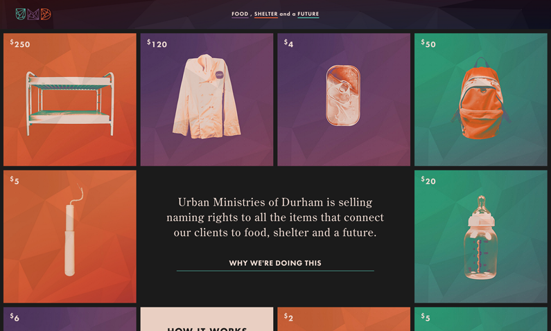
This project was created by Urban Ministries of Durham. The website was designed to raise money for their projects by selling “naming rights” to food items, shelter or objects which are then provided to homeless populations. The user experience consists of interactive boxes featuring prices for options such as “Name this Bunk Bed” or “Name This Interview Outfit.” The innovative web design supports a concept which is really refreshing, allowing a potential donor to participate in a new way.
Things this site does well:
Website Navigation: Simple and clean with the most important facets of their cause: Food, Shelter and a Future. Users can view all items or just a specific category.
Uses Scrolling: Clear instructions guide users to scroll through the site to find information on how to participate as well as more detailed information about the cause, donors and how much the organization has raised for homelessness.
2. Conservation International

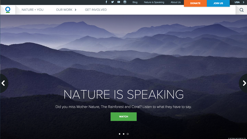
Conservation International works to protect nature for the benefit of people. Their website is heavily dependent on the use of nature images and a large, bold call-to-action.
Things this site does well:
Content organization: This site is really well planned. The organization of the site allows the viewer to easily digest important facts and blurbs about Conservation International. One of the most interesting parts of the homepage is the use of large circles which flip to reveal text as you roll over them to give visitors a quick idea of who makes up the organization. This is a great example of how more content doesn’t equal better. These short blurbs provide the audience with quality content fueling their curiosity to dig further into the site rather than try to fit everything on the homepage.
Strong Use of Visuals:
Compelling images connect the viewer with what and who they are going to support. For many non-profits, this is an important aspect of their bottom-line: contributions for time, talent and treasure.
Prominent Donate /Join Us button:
Speaking of the bottom line, this website does an excellent job of featuring prominent contribute buttons in the top right corner. You may not need a contribute call to action in the top right but make sure to feature it prominently throughout your website.
3. Ice League

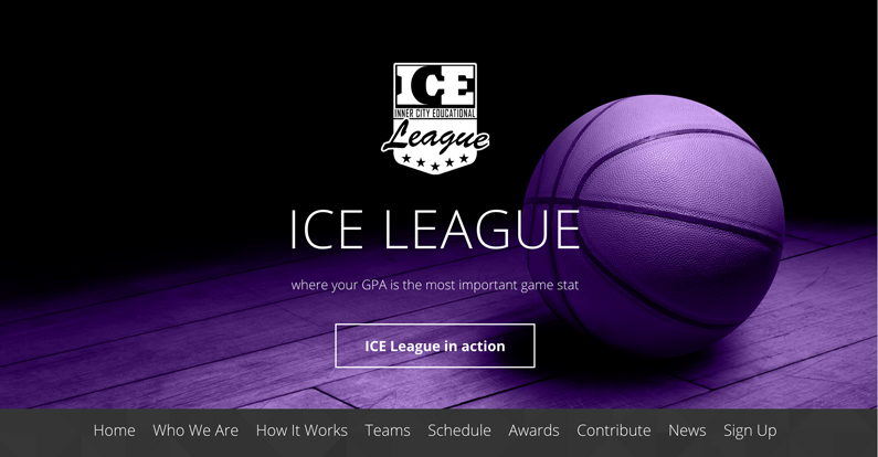
Ice League is a basketball league put on by the non-profit Project Leadership in Muncie. Roundpeg was asked to create a sleek new look for the new league.
What This Site Does Well:
Content Organization: There is a lot of information on this one page site but it is actually well placed and digestible. We broke up the sections so that information could be displayed in circles, through pull-out quotes and there are plenty of call-to-action buttons throughout the site leading you deeper into the site.
Branding: The brand’s message is strong across the site. This website is an extension of the Ice League brand and will hopefully help their organization thrive and attract potential sponsors and donors.

