Spend enough time in any one profession, and you’ll begin to develop personal preferences for “the way it should be done”. Painters can’t stand visible roller marks on a wall, landscapers get queasy at crooked mower lines, and bookkeepers want their spreadsheets to be ‘just so’. Graphic designers are no different. There are some common design mistakes that give every (good) graphic designer an eye twitch. If you’re a designer who is reading this, take this article as a confirmation that you are not alone in your suffering. That pink, yellow and chrome logo really is hideous, it’s not just you. As for anyone else reading this article, please accept this list as a guide for what NOT to ask your designer to do for you or your company. (Unless you are agreeing to bring Pantone-perfect Jell-O cubes to them in the psych ward)
Here are a few of the top things that might make designers want to run away screaming:
Bad Spacing
There are several things that fit into this category. Kerning, leading, and white space are the three that stick out to me. The first two have to do with the spacing of text, while white space is a more broad term for negative space overall.
- Kerning is the spacing of individual letters. One of the fastest ways to drive a designer crazy is to show them an example where letters are either smooshed together, or strung out willy-nilly.
- Leading (pronounced led-ing) is the space between lines of text. Sometimes, tight leading can be used in a purposeful way to create more visual interest. When used improperly or carelessly, leading can cause lines of text to run into each other, or be so far apart that they don’t seem to go together anymore.
- White space is the negative space in a design. No, it’s not always white in color. It just means the ‘empty’ space. Filling up the space with ‘stuff’ does not make it more effective. White space allows for visual hierarchy, repetition, alignment, patterns, balance, contrast and many other design principles. Without enough white space, designs will look cluttered and busy. Good use of white space is tasty like bacon.

Cheap Logos
Not all cheap logos are inexpensive, and not all expensive logos are valuable. I’m not saying that your $10 logo is horrible, all I’m saying is that it’s not very unique. Even if you paid $1,000 for it, if you got it from a stock logo factory, chances are, there’s another company out there with a very similar looking “logo”. We’ve all heard the old adage, “you get what you pay for”. Sure, you might have saved a few bucks (or maybe not), but what you saved in design cost, you probably gave up in potential sales because now you blend in with the masses. Good graphic designers spend a significant amount of time researching you and your competitors and then translating that information into a unique visual representation that sets you apart from the pack. (Click here to find out What Your Designer is Up To)

Misused Fonts
Sometimes it doesn’t even matter how you space it; certain fonts are just plain ugly. By now, you should’ve heard that Papyrus and Comic Sans are off-limits (If this is the first you’re hearing about it, please…just…don’t), but there are several new additions to the list of overused and abused fonts. Right now, there’s a huge debate between designers about the use of Lobster and Helvetica. This goes back to what I was saying about out-of-the-box logos. Sure, it might be “the look” that you had in mind, but that doesn’t mean it’s unique.

Stretching and Squashing
There’s almost nothing worse to a designer than seeing a well-designed logo or graphic being distorted at the top of a website or presentation. Designers take special care to make sure your graphic material is proportioned and scaled correctly. When non-designers get a hold of a logo and decide to stretch it across the top of the page disproportionately, it has been known to cause minor brain hemorrhaging to the observing designer. If your logo or graphic needs to be scaled to a certain width or height, make sure that it’s scaled proportionately. Don’t ruin a great logo. Leave the stretching at the gym and the squash in the garden.

Horrendous Colors
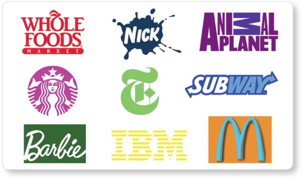
Insisting on a rainbow of colors for your branding is not only going to make your project look unprofessional, but it runs the risk of making your logo illegible and inaccessible to people with certain disabilities. While a color palette may seem subjective and up to personal preference, it has been carefully chosen by your designer to communicate less tangible aspects of your brand, like personality or to elicit emotional responses from your potential clients. Calm and serene colors like certain blues or greens are natural choices for spa and massage industries. Just because the owner’s favorite color is bright, fiery red does not mean it belongs in your graphic design if your business is about relaxation. Don’t believe us? Check out this post from Jenna where she shows just how powerful color theory can be.
The above are a few of the many mistakes I could talk about, what are some of the design faux pas that drive you crazy?
This post was edited on September 1, 2019


