Unlocking the Inbox
Disclaimer: vast amounts of in-depth research for this post were gleaned from quickly scanning my own inbox for a few minutes. I need a moment to lie down after the visual assault of brazen text and bright images. Flipping through about fifty different messages like television commercials, only two or three induced me to linger and actually read what they had to say. Here are the notes from my investigation that will help your email stand out.
Keep It Simple…
The number-one design principle applies to every facet of life, especially your newsletter. Design your email with a specific purpose other than providing the viewer with direct access to your entire inventory or list of services. That’s what your website is for and, when well-executed, your email will likely cause viewers to click through and see what you have to offer.

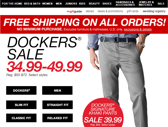
Color is also an essential tool in guiding your viewer’s eye. Yes, red is a glorious, attention-grabbing color but the above email has so much going on my eyes are bouncing around. There is no hierarchy; I have no idea what they want me to read first. Sure, free shipping is engulfed in bright red, but the sale is in larger type and accompanied by an image so should I…wait there’s a red sticker at the bottom. I’m moving on and I haven’t even glanced at the top navigation.

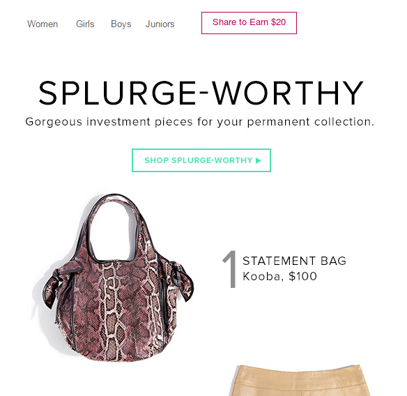
Ah, a breath of fresh air. White space will do that for you. Simple type and understated colors allow my eyes to drift in an orderly fashion. First I see the purse. I have no immediate need for an animal-patterned bag but I stay because of the enticing layout. Next to the red button. Share to Earn…? Money for what? “Splurge-Worthy.” Oooh. Don’t mind if I do. This email also adds the allure of the hunt with tastefully selected images. These are not quite what I’m looking for, but what else do you have? *Click.*
CTA, Loud and Clear
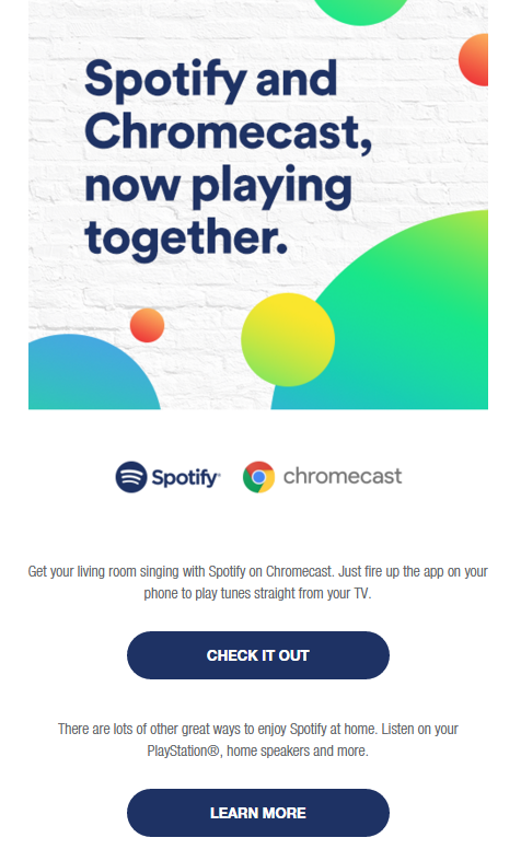
Another aspect in which the Dockers-sale-shipping-kitchen sink email falls short is the lack of a clear call to action (CTA). After reeling your reader in with an attractive layout, you need to gently guide them where to go. Splurge-worthy leaves you three options from the initial screen: share, shop, or scroll to continue perusing the merchandise. Another excellent example is this succinct announcement:

Plain and simple. Tasteful colors add interest to a single sentence letting you know why you should pay attention. Only two options are provided: check out this offering and try it on for size. Don’t know much about Chrome or Spotify? Click the handy dandy button to learn more. Note how the buttons are clearly secondary from the initial image. How does your brain know that? First, the darker, solid color is not the center of attention in direct contrast to the bright hue bubbles. Secondly, the type is a smaller version from the header. If they had chosen a different typeface, especially a serif, the overall look might look sloppy and confusing.
Have a little more information to convey than a headline? When you’re utilizing email to keep everyone up to date or to share an article or an intriguing interview, the same principles apply to larger chunks of copy. Keep it simple. If it’s an article, include a few paragraphs and use a button to direct the reader to your website. A single-column format tends to look best on all email platforms, especially mobile. Using an image to introduce your content is often ideal, but images interspersed throughout can be distracting.
Before you hit send, check your work. What’s the main thing you want the receiver to do when they see your email? Can you tell what the main call to action is after only a quick glance? These are the kinds of emails that will produce results.
Listen for more on this topic.
got a project?
Whether you need a new website or some help with your social media we are ready to start the conversation.

Chatbot Basics 101
Let's talk about chatbots. You know, those things you sometimes message on different applications...
Favorite Social Media
What is your favorite social media platform? Remember the days when there was just Myspace? Oh,...
Call to Action Do’s and Don’ts
There is such a thing as a bad call to action The goal of any page on a website, whether it's the...
5 Ways to Engage Your Audience on Instagram
With over a billion active users worldwide, Instagram will never run out of fresh visual content....
