Wouldn’t it be great if you could just walk up to people and tell them what you wanted them to do? You could try it, but people might look at you weird. Don’t worry though, there is a place where you can tell people exactly what you want them to do – in your website’s call-to-action, or CTA, buttons.
Your customers and potential customers are smart, but years of web surfing have them expecting to be told what to do on a website. If you don’t explicitly tell them what to do and give them an easy way to do it, they’ll most likely navigate to another website where the action to take is clear.
We’ve talked in the past about the design aspects of CTAs and the style of buttons you can use in WordPress, but today I want to focus on the language of CTAs. First, you need to decide something – what action do you want your customers to take? Some ideas include: scheduling an appointment, adding an item to a cart, downloading a whitepaper or giving you a call. Once you’ve got one action in mind, follow these tips for writing your CTA.
Focus on: Action Verbs
Your CTA is designed to do one thing: take action. The words you choose for your buttons and call to action should encourage and help convey that need for action. Words like download, buy, click, call – these are action verbs, i.e., the best verbs, because they spur people to action! Always start your CTA with an action verb, it makes your writing more exciting and gives readers something to actually do.

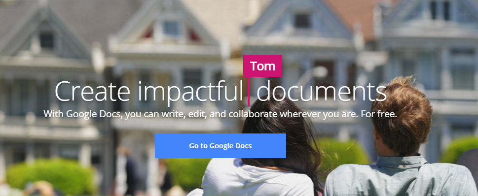
How do you create impactful documents? You go to Google Docs.
Focus on: Urgency
By creating a sense of urgency, you can compel your readers to make immediate action and move along the sales funnel more quickly. Have a sale going on? Give your customers a sense of urgency by including when the sale ends. You can create urgency in the words you choose in your buttons as well. Make them feel like they must make a choice right then and there by using words like “today” or “now”.

Focus on: Voice
You’re using an action verb and the action is urgent. Use a voice that’s engaging and exciting to pull people in. It’s okay to use exclamation points here! The product or service you offer is great and your customer will benefit from it – definitely an okay time for excitement. Remember, the bat-and-ball is good in small doses; only use it once or you’ll lose the effect.

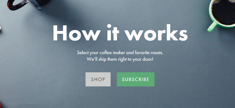
It is very exciting to get coffee shipped to you, as shown by this Hi-Line Coffee CTA.
Focus on: Benefit
Not many people will do something just for the hell of it. Unless they identify something about the action that will benefit them, chances of them clicking, signing up, etc may be slim. Ask yourself “what’s in it for me?” if you were in their shoes. Will your whitepaper help improve your business? Can your customers try it for free? Think of the benefits of what you’re offering and share the benefit. Are you offering exclusive information, content or even a coupon? Users are much more likely to click if they see benefits up front.

You’ll be the first to know about these luxe, limited edition Italian shoes, M.Gemi just needs your email.
Focus on: Lead Up & Button
There is a difference in the language you’ll use for these two areas. The lead-up text is introducing the product or service and showing the benefit. You can be clever in the lead-up text; in fact, this is a great place to be creative and persuasive.
However, in the button text, you want to be as clear as possible. This is where you tell them exactly what they’ll be doing and you don’t want to obscure the action. Keep the button text short and snappy, around 1-5 words.

Now it’s your turn. Try writing some CTAs and see which ones get the most clicks. Keep testing until you find CTAs that work for you. If you are craving more web design tips, check out our conversation with Peter Wolfgram on More Than A Few Words.

