Why Roundpeg? Compared to other Indianapolis agencies, why do you want to work here? I stared at...
Taylor's Latest Posts

Your Content Marketing Resources
Content marketing is a ginormous elephant of a word, covering everything from blogging to social media to email marketing with its wrinkly grey body. Thankfully, the intrepid writers at Roundpeg have been tirelessly pumping out blogs focused on helping you improve your content strategy for years.
Learn the Way of the Content Style Guide
Are you creating content for your brand? You are? That’s dope! But make sure you’re keeping a few things in mind: Is your content “on brand?” Does it maintain a consistent voice? Are you writing for your primary audience? Do you have any idea what these questions mean? If the answer to any of those questions (especially the last one) was no, that’s ok.
How to write when you have nothing to write about
When you’re stuck for a content idea, what do you do? You can’t always count on inspiration to smack you upside the head (I learned that the hard way), so it’s up to you to go looking for it at some point. Here are a few content topic generation helpers that I’ve encountered that I’ve found useful in curing my pizzabrain.
The Company that Mastered Branding
In all of my marketing classes throughout college, when someone wanted to give an example of a company or brand that marketed an “attitude” or “lifestyle” successfully, they would always mention Nike. And they were completely correct.
3 Retail Marketing Tips
Like a lot of my fellow college students in the 21st century, I had to work retail for a few years to make ends meet while juggling being a full-time student. The business owner made the call to let the employees run social media, the business website and more. Not only did we find some success in doing so, but I personally learned a great deal about small business retail marketing – some lessons which translated to what I do now with small businesses at Roundpeg.

The Importance of the Welcome Email
Email marketing is your gig, right? You know what you’re doing: you’re building good lists, have great content to share on a regular basis and you’re even able to do some pretty cool design work within your emails. So why do you keep seeing opt-outs and spam reports?
When to Leave your Pet Project Behind
So you’re a business owner and that’s pretty cool. You’re probably doing a lot of things right, making great business decisions and keeping everything running smoothly. You’ve probably also got a few pet projects going, those projects you’ve wanted to do for a while and are a lot of fun but may not be completely vital to your business and its success. One of the keys to keeping your business successful and managing your time is knowing when to leave these pet projects behind. They may be tons of fun but those projects can easily spiral out of control, taking you away from the core duties of running your business.

Cramping My AP Style
I remember it like it was yesterday. I was checking out the list of required texts for my class COM 215: Writing for Print. At the top of the list in boldface and all-caps was AP STYLE GUIDE (NEWEST EDITION PREFERRED). Through school, internships, my professional life and even in my personal writing life, my AP Style Guide has been the Robin to my Batman; the Garth to my Wayne; the Scully to my Mulder.

Keeping Your House in Order
Your website is your business’s online home. Though it may have a nice condo (Facebook), a sweet summer home (Pinterest) and a dumb little timeshare you got tricked into signing onto (Angie’s List), your business’s forever home is your website. It’s the place you want to bring people to show off all your cool stuff, the place that’s going to say the most about you and, most importantly, the place where you have the most control of what it looks and feels like.
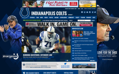
You’re the Best (Sports Website) Around
Sports teams’ websites have to do a little bit of everything: they promote events, sell merchandise, build awareness and lots of other little things you may not realize. Thankfully, almost every big sports name in Indiana does a great job with their web design – and since they have to do so much, there’s a lot that we can learn from their choices.

The Long Tail & Short of It
When I tell people that part of my job is improving clients' SEO by writing web copy, very few of...

Roundpeg Web Redesign: Meet the Team
As you may have noticed, things are looking a little different on Roundpeg’s digital digs. Weeks of planning, discussion and lots of hard work resulted in a refreshed look for our cozy corner of the Internet. Without a single page going untouched in the redesign, we took the time to make sure every word and image on the site reflects who we are and what we do.